In 2018, how did I help “Dream11” solve major usability issues?
About Dream11
Dream11 is India’s Biggest Sports Gaming platform with 100+ Million users playing fantasy cricket, football, kabaddi and basketball. Dream11 is a game of skill that offers Indian sports fans a platform to showcase their sports knowledge. Fans can create their teams of actual players from upcoming matches, score points based on their on-field performance and compete with other fans.
Background
In 2018, I was in discussion with @Harsh Jain — Co-founder & CEO of Dream11 regarding his revolutionary product and the million $ business model. During our discussion, my 1st question to him was “How did you crack this business model?” He laughed and explained about, how it all started. He also explained how Dream11 team value their users and their experience, this is why users are always at their top priority.
Well the purpose of our discussion was, he wanted me to invest my time in helping him identify the most critical problems on his application and give my recommendation to make the users journey more smooth and playful.
In 2018, the Dream11 app was being used by 20 million users and I was just wondering if I could solve a single critical problem, it would directly affect millions of users. I eventually accepted the initiative and decided to take my time doing usability analysis on their Android app and create a valuable detailed report to share with the Dream11 team to take action on the recommendations.
Why Usability Analysis?
The purpose of doing usability analysis is to identify usability problems, collect quantitative data on participants’ performance, as well as determine user satisfaction.
If the product is difficult to navigate or doesn’t clearly articulate a purpose, users will leave. Making it so they don’t leave, makes usability analysis a necessary task.
Methods Used
I used 2 methods to accomplish this task which are as follows:

- Expert Review:
An expert review is a cost-efficient way to identify major usability problems. Instead of requiring several weeks for finding users, running the tests and writing up a report, an expert review can be completed in less than a week. The expert review conducts by a usability analyst who points out problems and provides recommendations based on his extensive experience and in-depth knowledge of usability principles. The expert review can save a lot of money by making the product easier to use and fulfilling the user’s expectations. - Users Review:
This method is based on summative usability testing exercise conducted by a usability expert with actual users & close to the target audience/personas. Target audience is the one who is the primary users of the product.
Usability Principles
During this exercise I adhered to the following usability principles:
- Efficiency:
- Efficacy: Accommodate a user’s continuous advancement in
knowledge and skill.
- User Control: Make users the initiators of actions rather than the
responders to increase the users’ sense that they are in charge of
the system. - Wok-load Reduction:
- Supportive Automation: Make user’s task easier, simpler and faster. Automate unwanted workload.
- Reduce Memory Load: Keep information display simple and consolidated. Allow recognition rather than call. - Communication:
- Structure: Put related things together, and keep unrelated things separate.
- Sequencing: Organise groups of actions with a beginning, middle, and end, so that users know where they are when they are done and have the satisfaction of accomplishment. - Error Prevention & Handling:
- Error Recovery: Provide clear, plain-language messages to describe the problem and suggest a solution to help users recover from any errors.
- Undo & Redo: Provide “emergency exits” to allow users to abandon an unwanted action. The ability to reverse actions relieves anxiety and encourages user exploration of unfamiliar options. - Consistency & Standards:
Follow appropriate standards for the platform and the suite of products. Within an application make sure that actions, terminology, and commands are used consistently. - Aesthetic & Minimalist Design:
- Simplicity: Reduce clutter and eliminate any unnecessary or irrelevant elements.
- Visibility: Keep the most commonly used options for a task visible.
Targeted Users for Usability Testing
There are 4 users I approached, those were close to the target audience/personas of this product to perform summative usability testing exercise is as follows:

Task Scenario:
Usability testing is a task-driven exercise, where the usability analyst narrates a scenario to the tester to help him to get into that situation to perform the given task.
Scenario: Assume that recently you came to know about Dream11 application from one of your friend. He explained how you can earn money by following your passion & utilising your cricket knowledge using this application.
Task to perform:
1. Install Dream11 android app on your mobile.
2. Create your best cricket team.
3. Play & Earn.
Instructions:
Instructions are mandatory for the 1st time users those are not familiar to the usability testing exercise to avoid unexpected behaviours and fulfil the purpose.
Do’s:
- Please, think-aloud whatever thoughts are coming to your mind while performing this task.
- Please try to complete this task as soon as you can, there is no time restriction.
- Please share wherever the difficulty you find in the flow, once your task is completed.
Don’ts:
- Facilitator/observer won’t help you in this task. Because in the real scenario there is no one will help the user as well.
Usability Testing Insights (Video Recording)
I have captured the following ratings based on the user’s testing experience and post-task interview questions.

User ‘Ravi Saxena’ has taken more than 12 minutes to accomplish a task, and not able to convince to pay for joining a contest.
Due to the following reasons:
- He was unable to identify what has to perform and how?
- A high amount of cognitive load due to cluttered and confusing visual representation especially on the team selection screen.
- The unacceptability of making the payment due to lack of game rules.
Discovered 5 Critical Problems
I discovered 5 critical problems during this process, those undoubtedly might be impacting on the users’ retention OR increasing the chance of huge drop-offs.
Problem #1:
Bad discoverability and installation hassles:
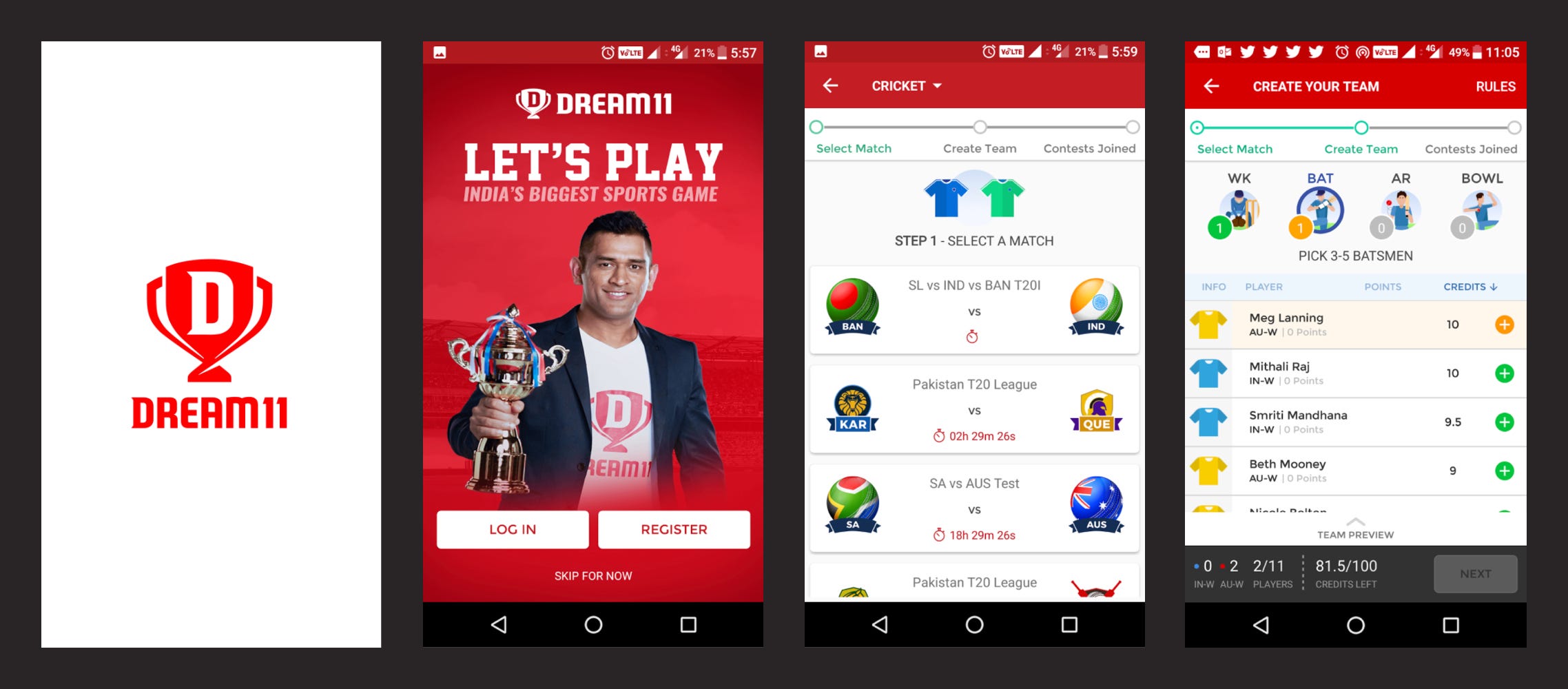
Unfortunately, this app is not available on the Google play store due to some reasons. Users have only option to install Android version from the Dream11 mobile site. The discovery of application and the installation process through the mobile site is a difficult and painful task for the users. (screens/flow below)

Recommendation:
The mobile site can be converted into a fully Progressive app until Google allows Android version on the play store. The progressive app can cover the entire range of mobile clients/versions, no installation would be required and no discovery hassles at all.
Problem #2:
Registration option on the 1st screen seems unreasonable/illogical for the new users, who have not yet experienced the product or convinced from it. Such options can lead to major drop-off.
Prediction:
“Skip for now” option would be the 1st choice of the maximum number of new users due to the above reasons.

Recommendation:
Since registration is not mandatory for creating a team, this option can be asked purposefully before making the payment and not for creating a team or a joining a contest. This will surely remove the barrier for the users those want to experience the product 1st.
Problem #3 (most critical):
The entire information architecture, visual representation and the basic usability factors are not matching users’ expectations.
Few Examples:
- Header Sequential navigation is failed to explain users about the game.
Select Match > Create Team > Contests Joined? - No option of help / how it works? in case users are not sure what to do and how to do?
- No game rules have been described to the 1st time users before getting into the action?
- Timestamp/clock icon with some values doesn’t convey the purpose or function of this element. No help/info there?
- No filter options available in case users want to rearrange matches by the popular teams or any other way?

Recommendation:
The entire information architecture of the screen needs to improvise. The language should be user-centric and match to users mental model. Pre and regular usability testing sessions will ensure the acceptance ratio of predefined usability factors.
Problem #4 (most critical):
This screen is the most important step of the game/flow and the most difficult step for the users to accomplish the task. Curious why? here are the reasons:
Reasons:
- The very 1st time when users experience this screen, the 1st question comes to their mind. What has to do here?.
- If somehow users figured it out what has to do, the 2nd question comes how? Due to lots of cognitive and visual load and lack of game rules.
- This step is divided into 2 sub-steps, that 2nd hidden/conditional sub-step (for selecting C & VC) comes surprisingly on the click of Next button.
- The visual representation of items selection are not consistent e.g. green, yellow, grey colours are used as indicators for WK, BAT, AR (wicket-keepers, batsman, all-rounder) on the top band and below + green & yellow icons are indicating differently? Yellow for success and Green for action, which increases users’ cognitive load.

Recommendation:
Hierarchical multi-level navigation structure can solve 2 steps problem. Regarding the visual representation of item selections/indicators, the product design system (visual assets, and patterns) needs to define.
Problem #5 (most critical):
Join contest: This screen looks like a marketplace of contests with endless options. No system intelligence has been built here for the beginner OR mature users/players. High cognitive and visual load, which can lead users to some random selections OR in case of frustration can lead to drop-offs OR delete the application after investing a lot of time.

Recommendation:
System intelligence can be built on this screen for handling a various range of users e.g. beginner, intermediate or advanced by their need, understanding or behaviour.
Let’s Come to the Conclusion
The number of problems I could identify can be solved easily to avoid users dissatisfaction and make them stick with the product for a longer period. The action items are as following:
- Usability factors need to define and validate through regular interaction with users and testing sessions.
- The entire information architecture (navigation, content, user journey) needs to redefine from scratch and also mandatory time investment required on building the product design system to define visual assets, and patterns.
- Should focus on solving 1 problem at a time, because a human can only perform 1 task at a time “Multitasking is a myth”. Having said that cover-up all possible scenarios and the relevant use-cases during the design thinking exercise and before the low-fi wireframes stage.
- Data is the key to success, keep tracking users journey & behaviour. Invest time on interacting and understanding users needs and pain-points, make quick and necessary iterations.
Thank you for reading :-)
If you liked this case study, please give me some claps so more people can see this post. Thanks! 👏
If you have any feedback, I’d love to hear from you. You can also connect with me on LinkedIn.